Logofolio
Logo designs for real business design contests.
Branding + Visual Design
Dr. Schönfeld & Kollegen
Designed as a logotype by playing with the letter “ö” as the only letter in the main name that resembles a human face with an open mouth which is relevant to dental business. The letter “ö” is extended into a happy smile with a sparkle to communicate positive emotion, freshness, and aesthetics as the business tagline, Oralchirurgie · Ästhetik, suggests what customers will receive from the service. The sparkle also draws attention to the smile more quickly, since we are psychologically drawn to human faces and can relate immediately.
Adaline Ka
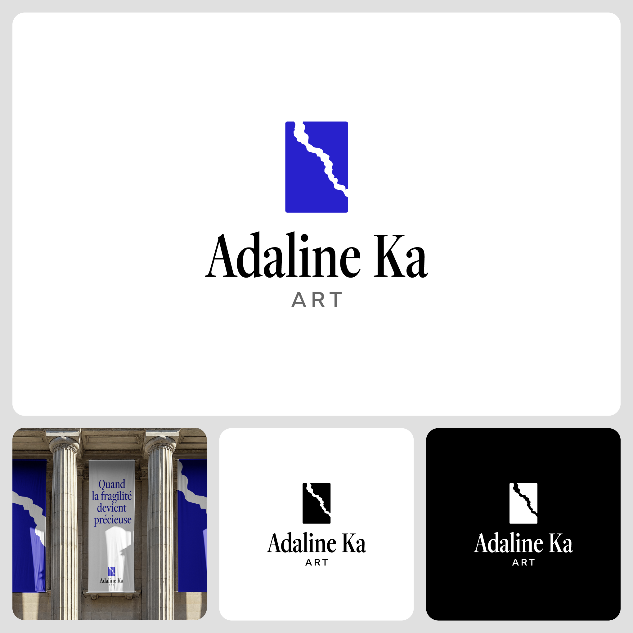
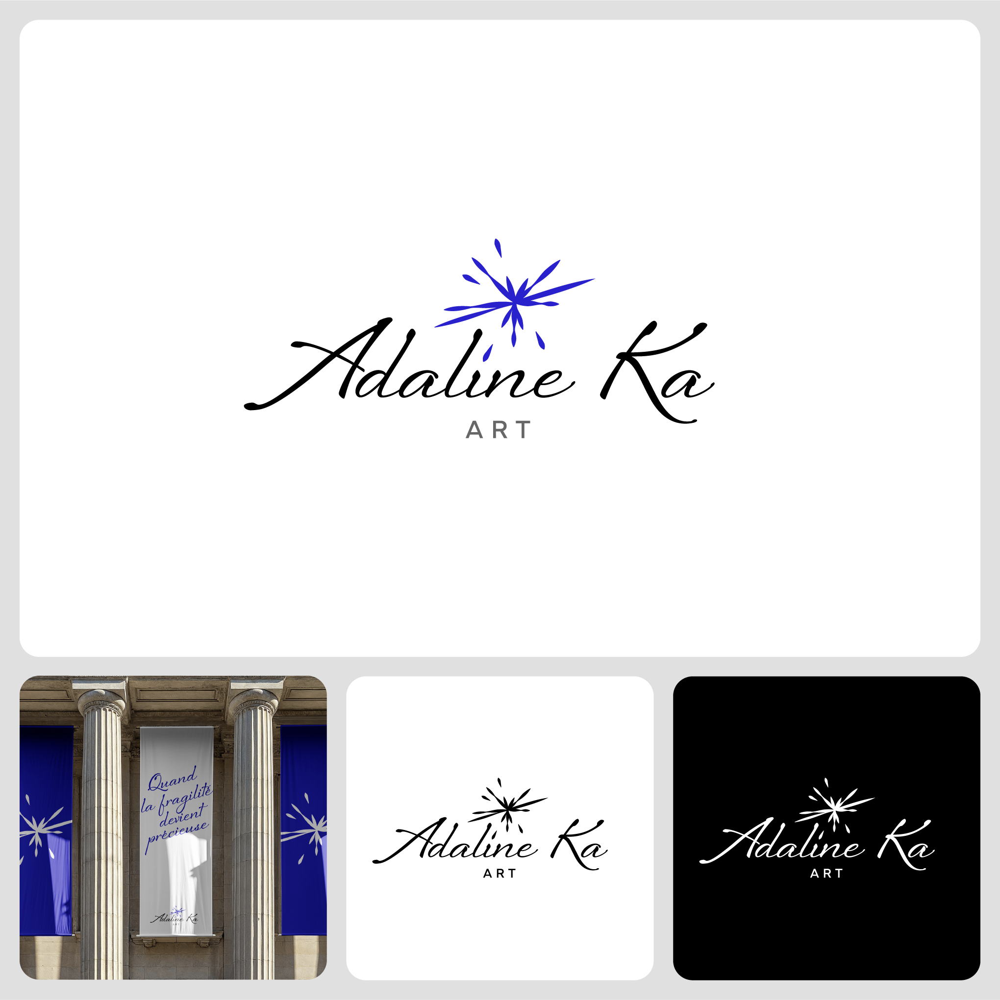
The logo uses art canvas proportion along with the sculpture’s cut shape and spark from the cutting method. Deep Klein Blue and black are used to build depth and glow within the artwork. The symbol can be used individually for small spaces on social media sites which still communicates the business concept.
Equitus Capital
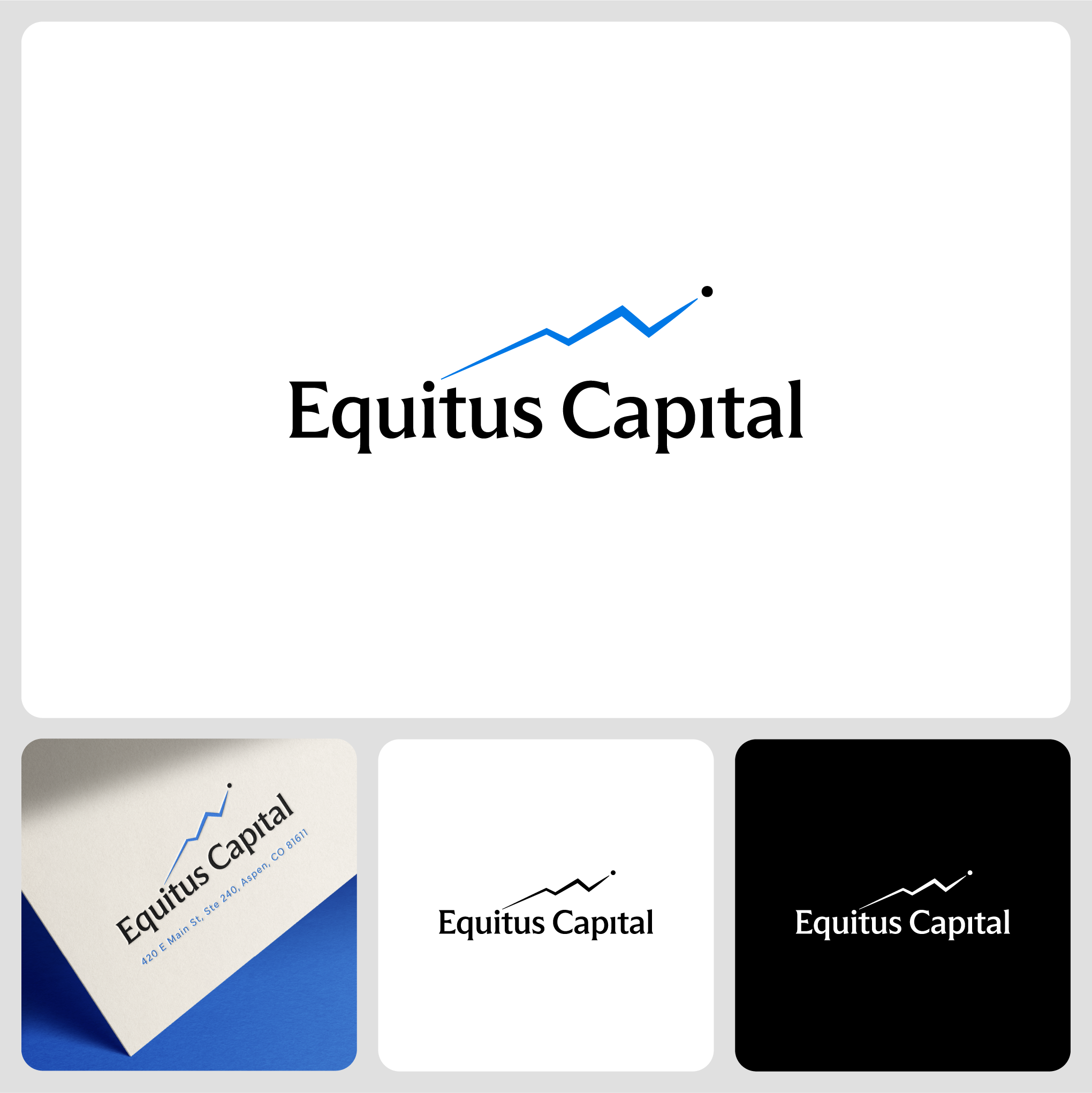
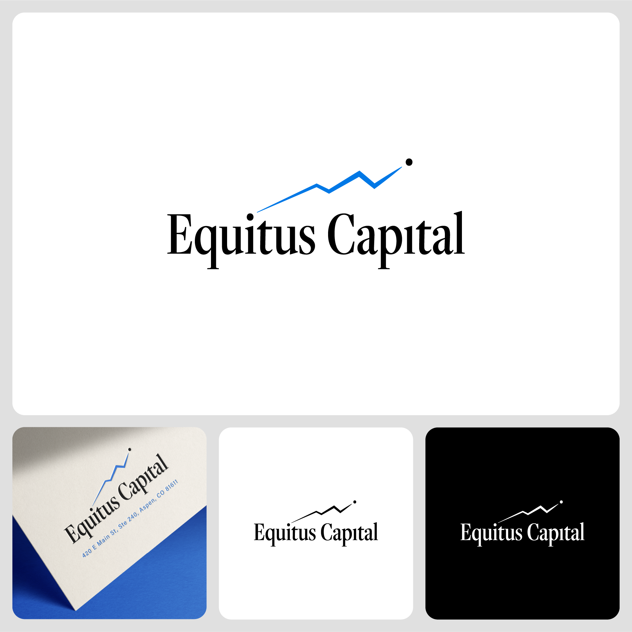
The central visual idea is an investment progression line graph moving from point A to point B as profit, carrying a double meaning tied to a section of the Rocky Mountains. The logo concept plays with two dots from the lowercase “i” in Equitus Capital name. Neutral tone is paired with a bold, bright blue from Aspen sky(is the limit for investment) to convey trustworthiness for financial business.
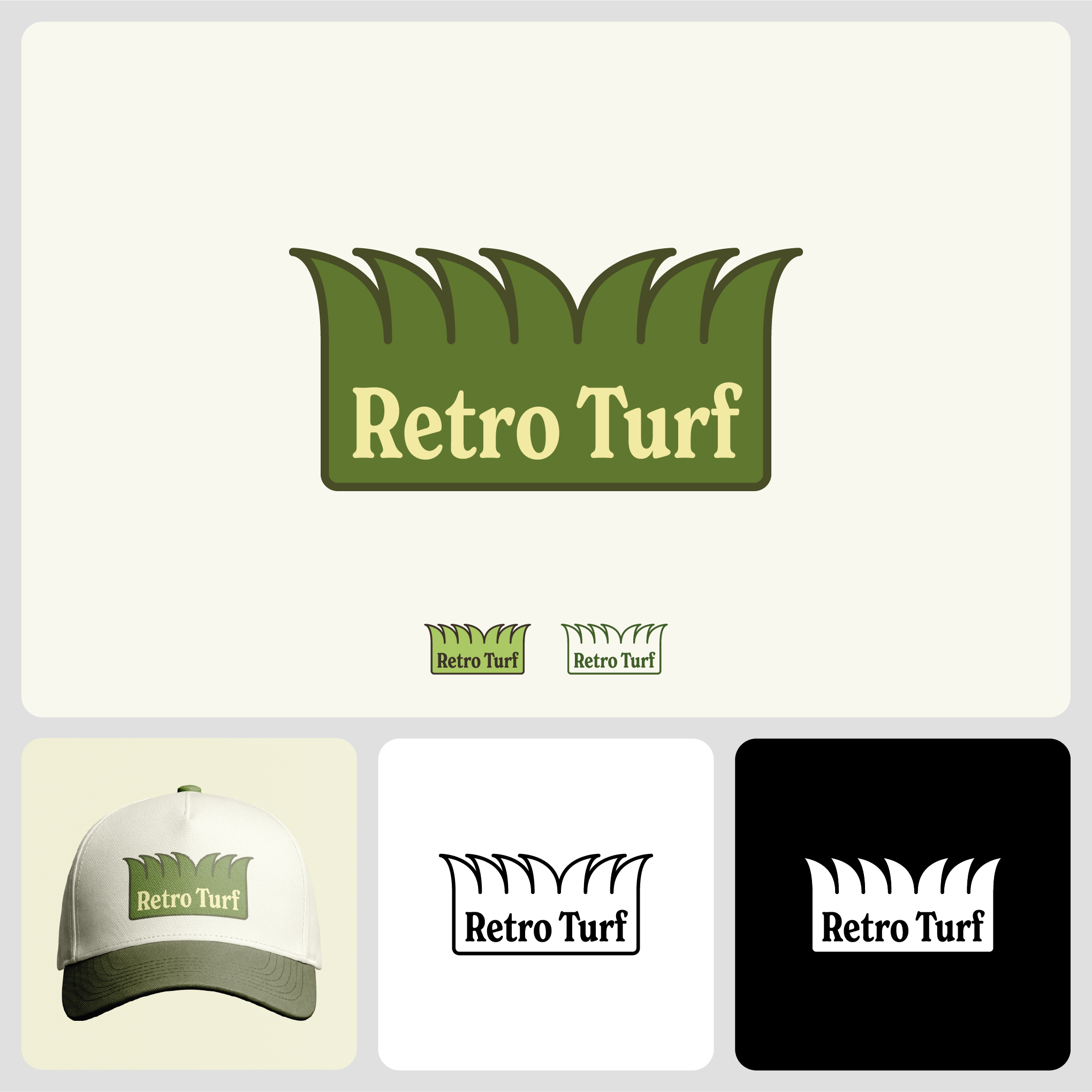
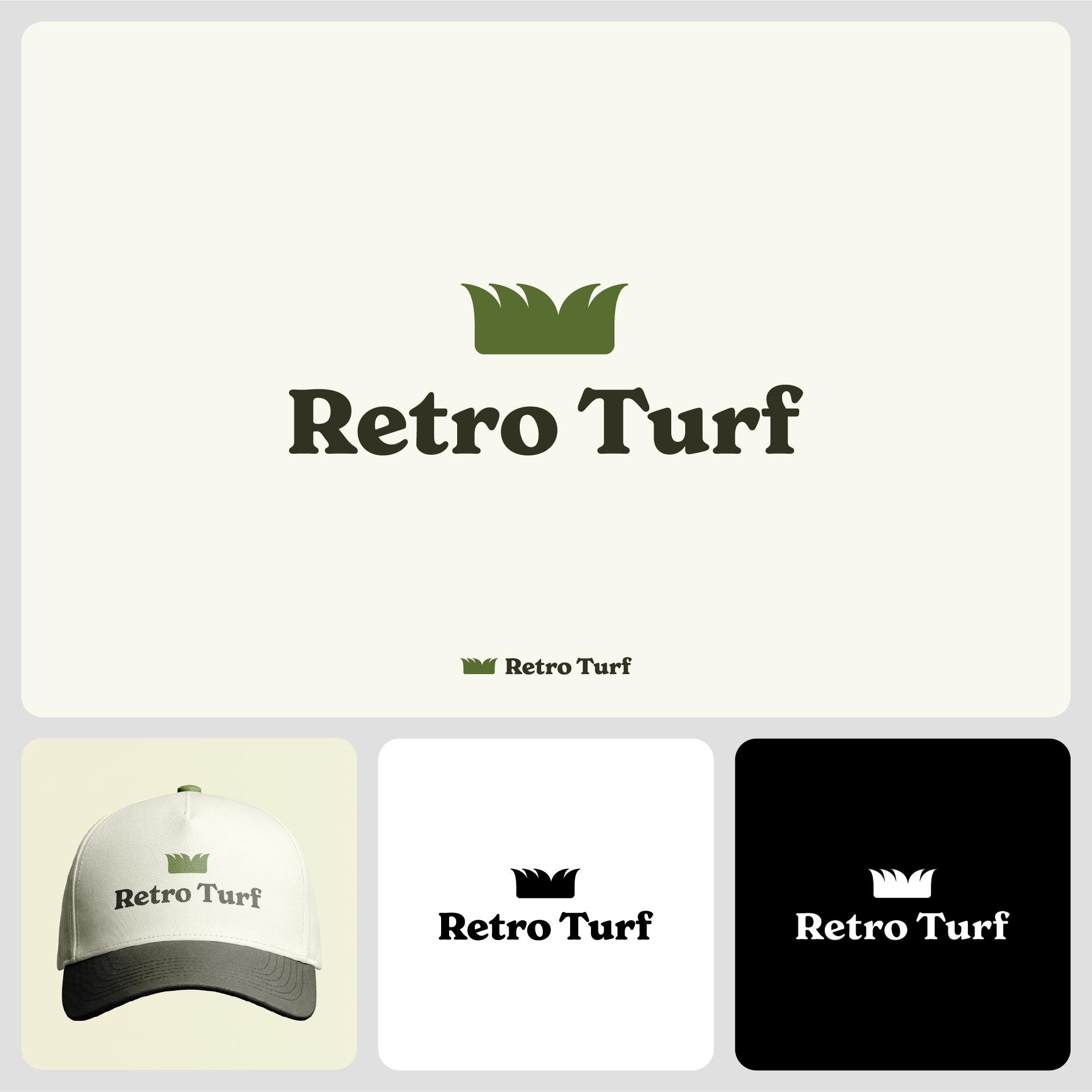
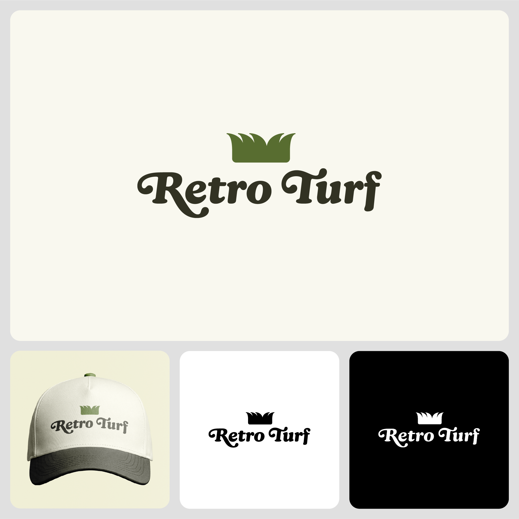
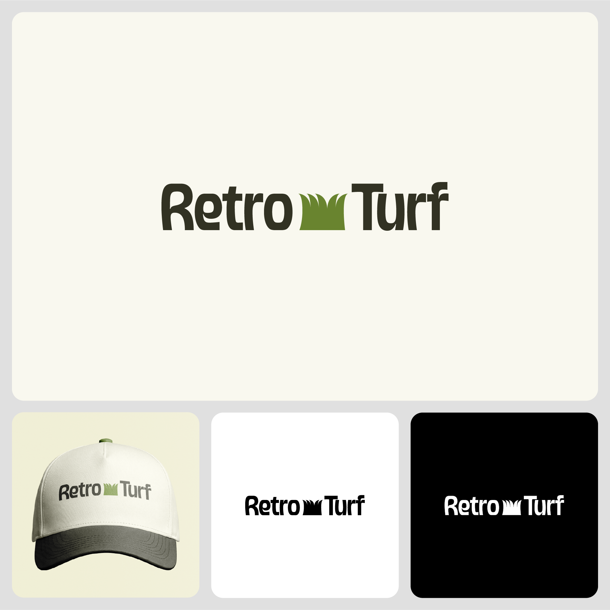
Retro Turf
The design features a stylized, minimalist patch of lush green turf, rendered in a bold, vintage-inspired graphic style. The typography uses a chunky, retro serif or script typeface, reminiscent of 1970s athletic branding, with a warm, earthy color palette of deep greens, mustard yellow, and burnt orange. The overall look balances a nostalgic, classic feel with a clean, modern aesthetic suitable for a contemporary turf business.
CarHappy
Concept 1
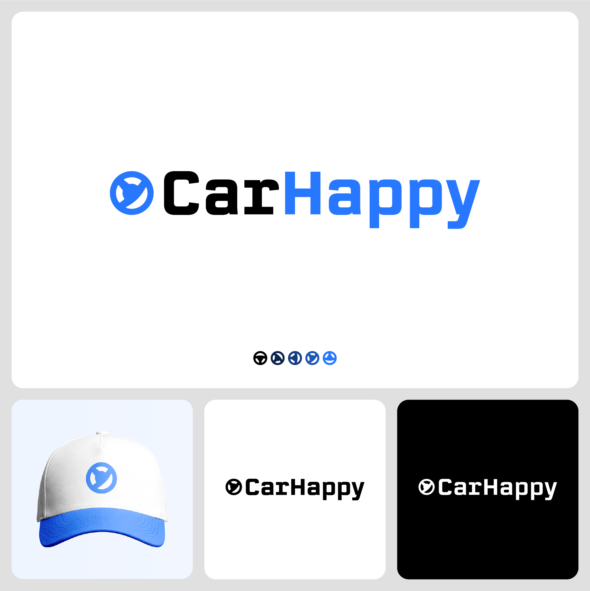
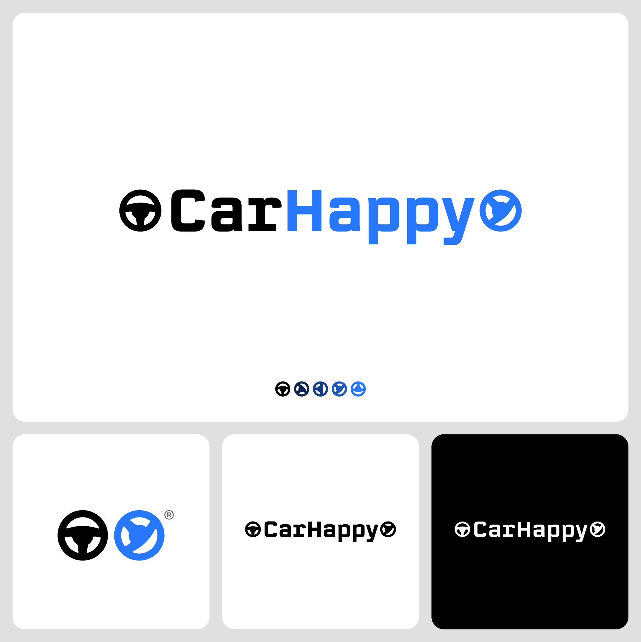
Steering wheel minimally designed with a happy face in the negative space(not all steering wheel designs create happy faces) to communicate car and happiness at the very same time. Online and offline satisfaction is altogether. Once you see it, you can’t unsee it. The symbol paired with a clear and bold automotive style typeface, giving modern and friendly vibes while still maintaining a minimal and neat design. Chosen steering wheel angle intends to represent dynamic movement of the automotive industry, as steering to the “right” direction, and not to make it look too unfamiliar for a steering wheel design.
CarHappy
Concept 2
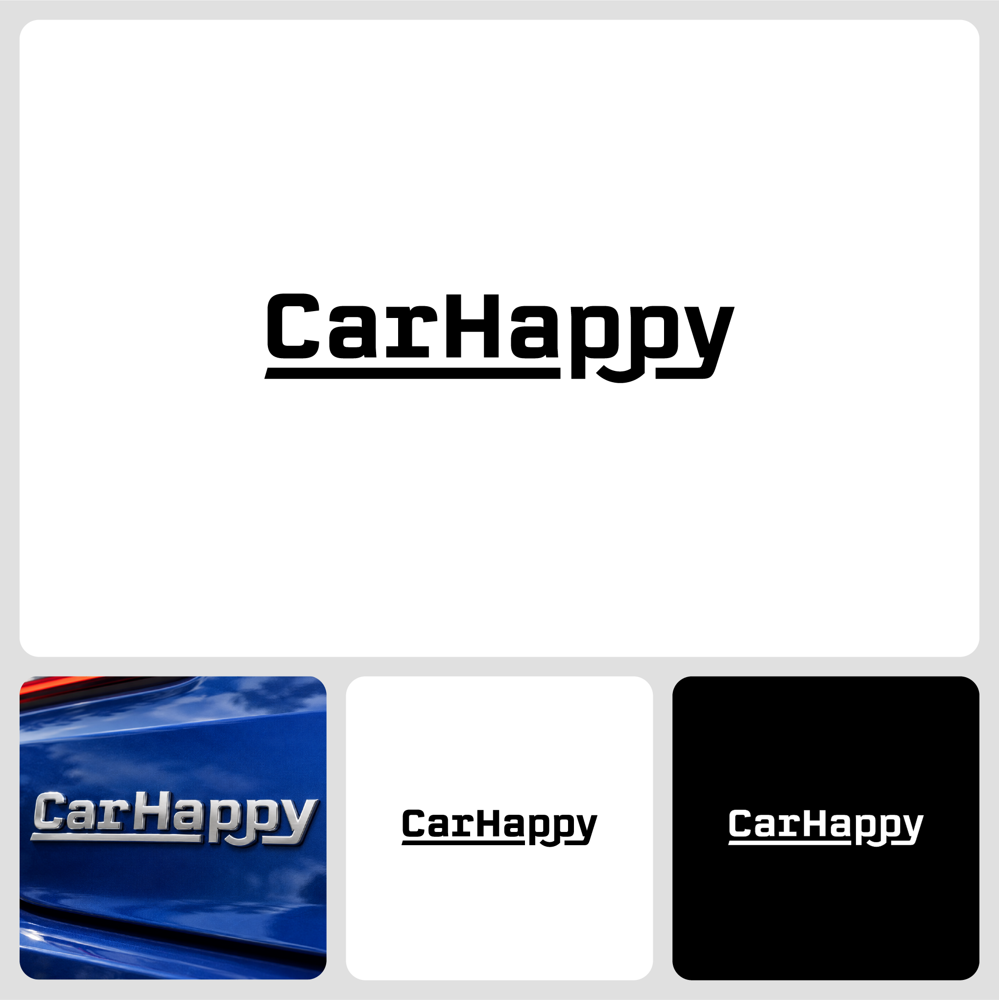
This design resembles a car logo badge style with a tweak between two letter “p◡p” to create a subtle happy face. At a big picture level as one story line of the business delivering unified experience, visualized with a connecting horizontal line, it looks sharp and professional with the subtle smile that gives a friendly vibe.
The Floor Department
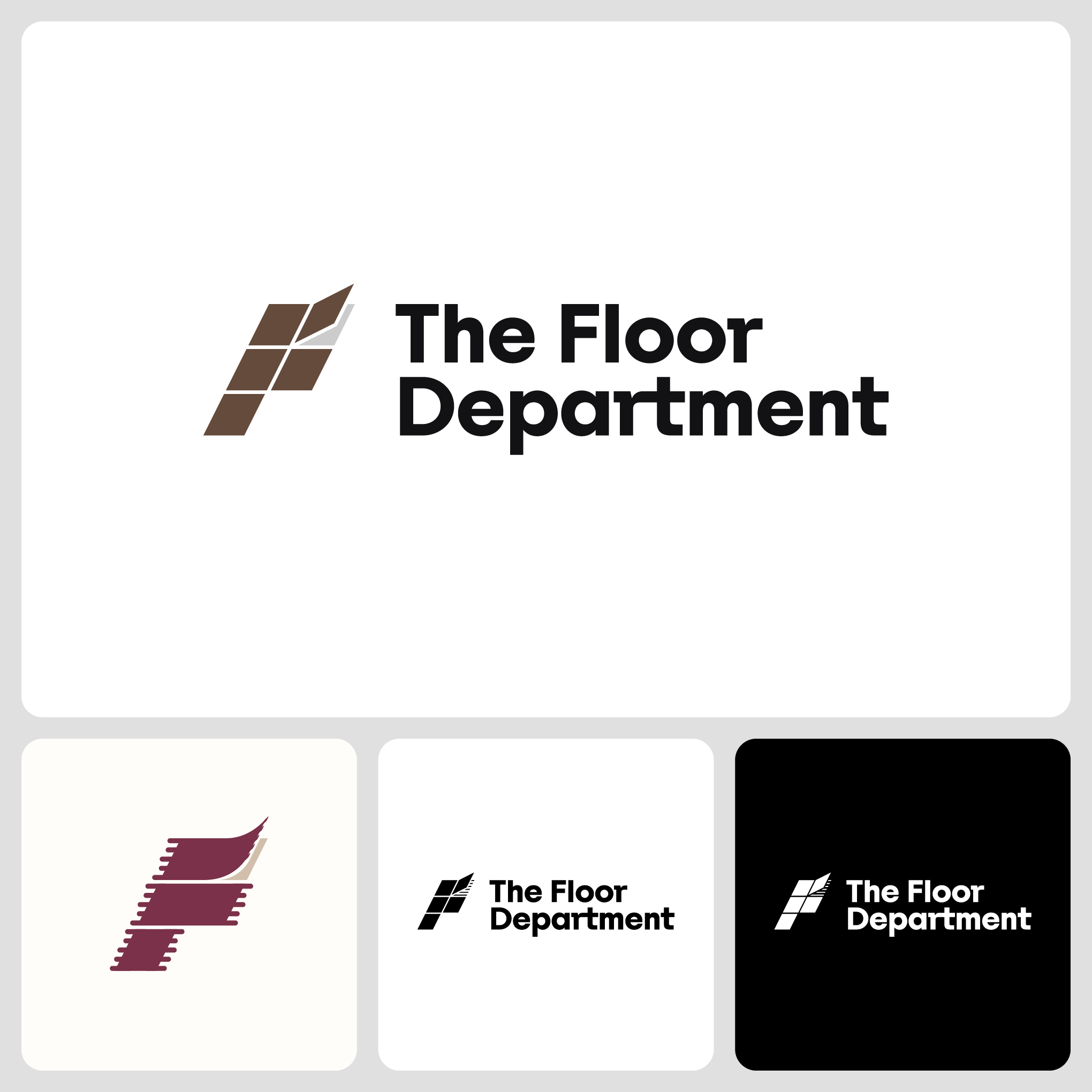
The symbol uses a 3D perspective of flooring construction to form the letter “F,” matched with a bold, modern typeface for the brand name to convey space, strength, and boldness while remaining approachable. This dynamic symbol concept can reflect any flooring type by swapping materials, textures, or colors such as wood, carpet, or tile. The tile design offers the simplest abstraction for flooring in general, so it serves as the primary logo. In a monochrome version, the space beneath the open flooring can be interchangeable with related textures, in the primary case, simplified horizontal lines. The selected colors are dark brown for wood or construction materials and light gray for concrete.
SMOQ
Concept 1
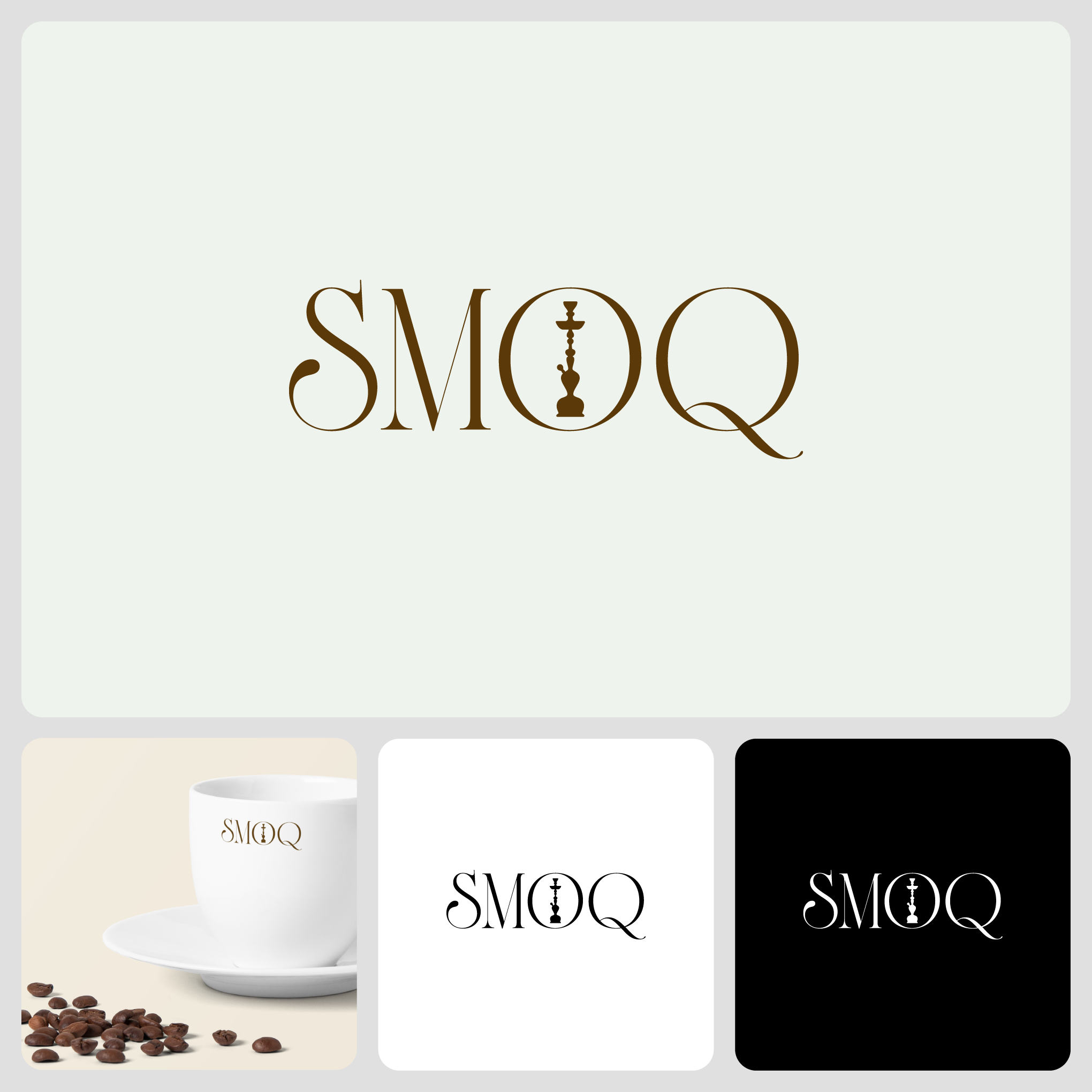
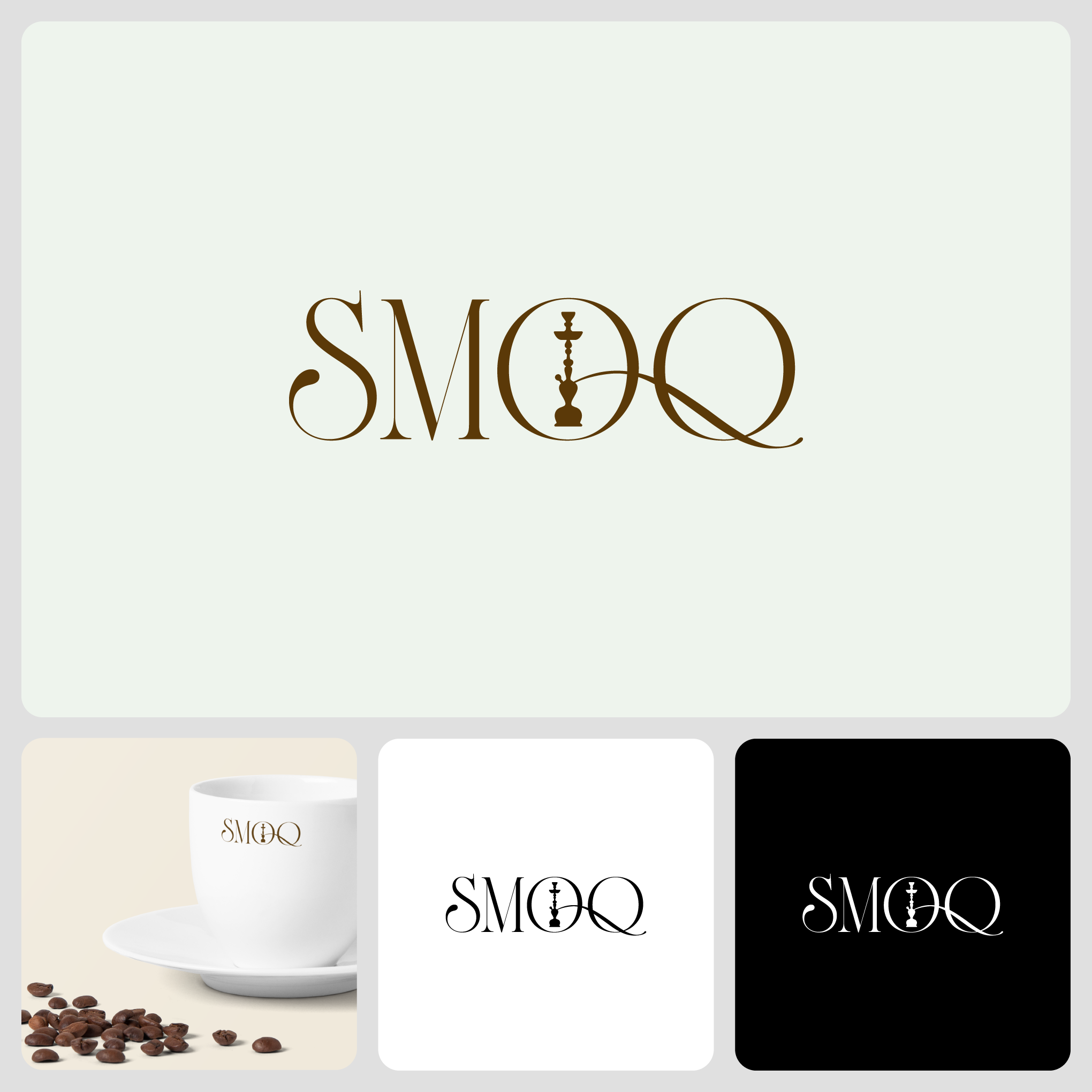
Designed with a typeface with beautifully clean strokes that delivers classic premium emotions with a sense of aroma dynamics, represented with the typeface’s curves, S/Q for example, from major products, specialty coffee, and hookah. Placing a sophisticated hookah silhouette inside the letter “O” creates a coffee bean shape with the hookah as the central crease. It creates a subtle double-meaning symbol with coffee and hookah all together while still maintaining the cleanliness of the overall design.
SMOQ
Concept 2
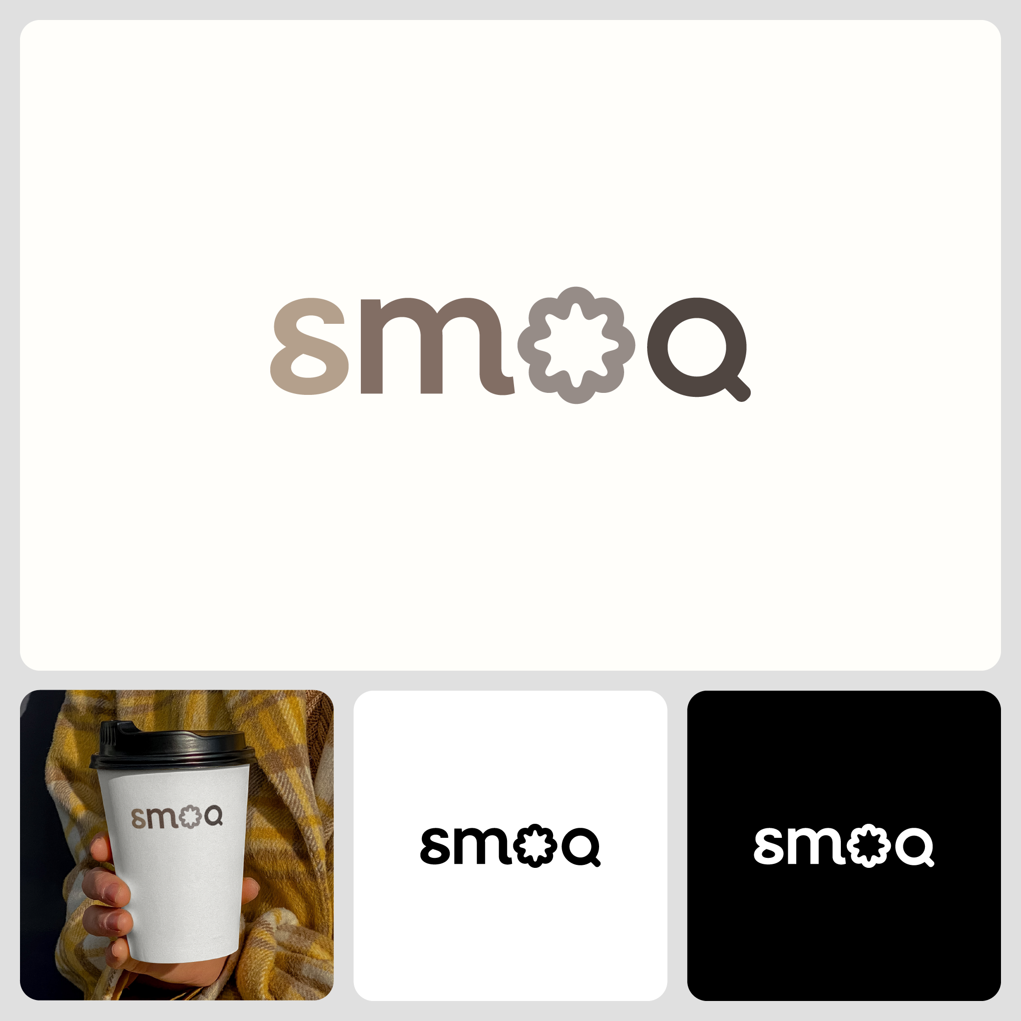
This design abstracts the concept of smoke and aroma by using the letter “O” as a combination of a top-view pour over coffee filter, as a way to enjoy single origin coffee, and a smoke symbol from the hookah business. The letter “Q” in the logo is designed as top-view coffee cup beside its preparation. The color gradation suggests roast levels of coffee beans from light to dark. Overall design remains clean, simple, and modern with personality that can be applied at different scales or applied with one color.
Tonally
The core of this visual identity is a variable typeface that responds to sound. Just as a sound wave expands and contracts, the weight and width of the text adjust dynamically based on audio input.