Wiredtech
Pull refresh IT consultancy’s visual identity.
Branding + Visual Design
Wiredtech is IT consultancy specialising in Microsoft Infrastructure and deployment technologies. Specifically SCCM/MDT building and deploying Windows OS.
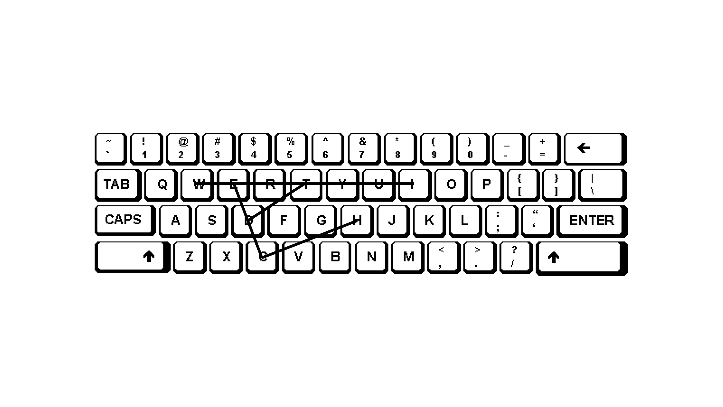
Behind the scenes of software lies programming, coding, and technical knowledge, all integral to the company's services. The new logo is designed to convey trust and feature a cleaner, modern aesthetic. Trust is symbolized through the use of bold uppercase type, drawing inspiration from a programming font closely tied to the company's service. This typeface has been customized for enhanced modernity and readability, especially in smaller formats. The abstract symbol in the logo represents the directional movement of typing the word "WIREDTECH" on the standard QWERTY Microsoft keyboard layout.