Women in Aviation The Netherlands Chapter
International organization expands empowerment to The Netherlands.
Branding + Visual Design
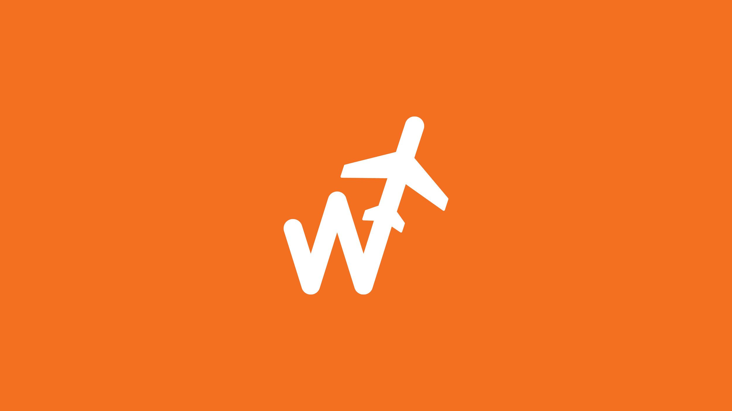
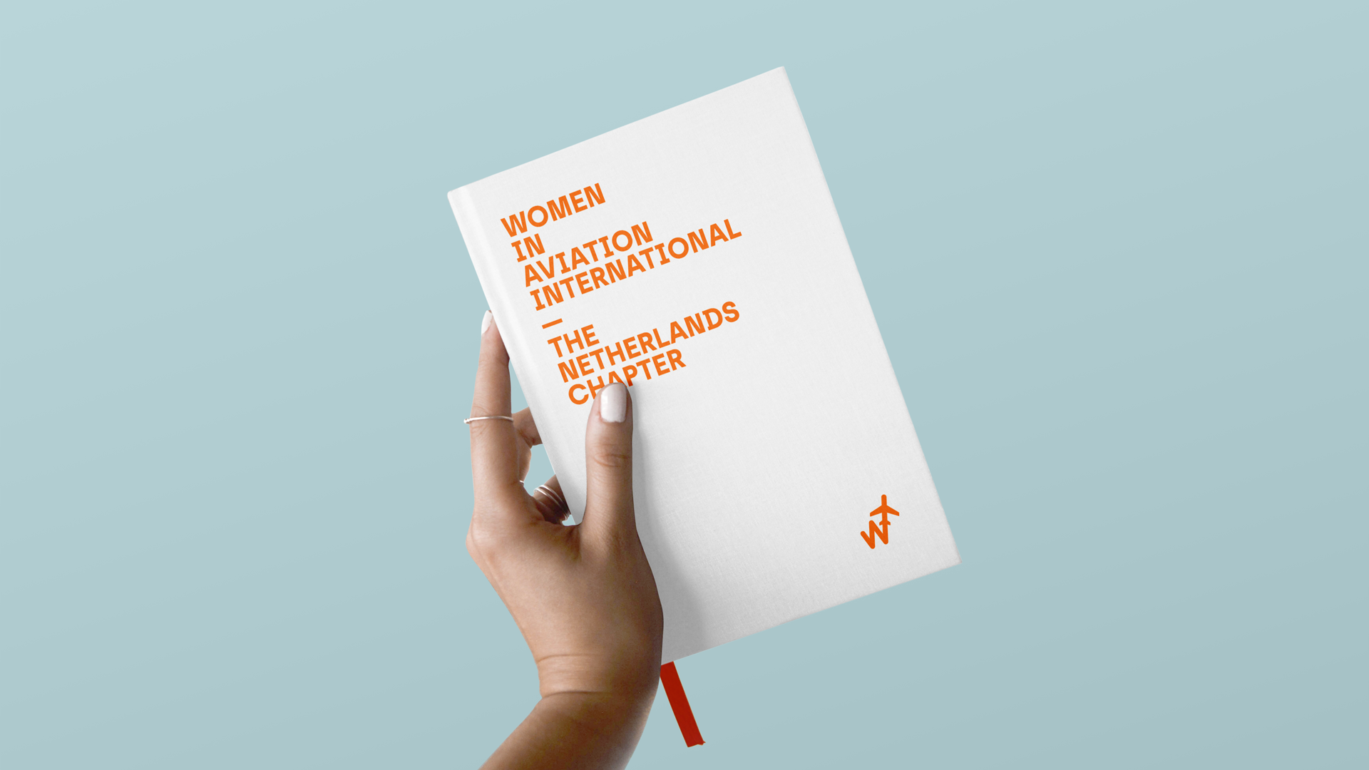
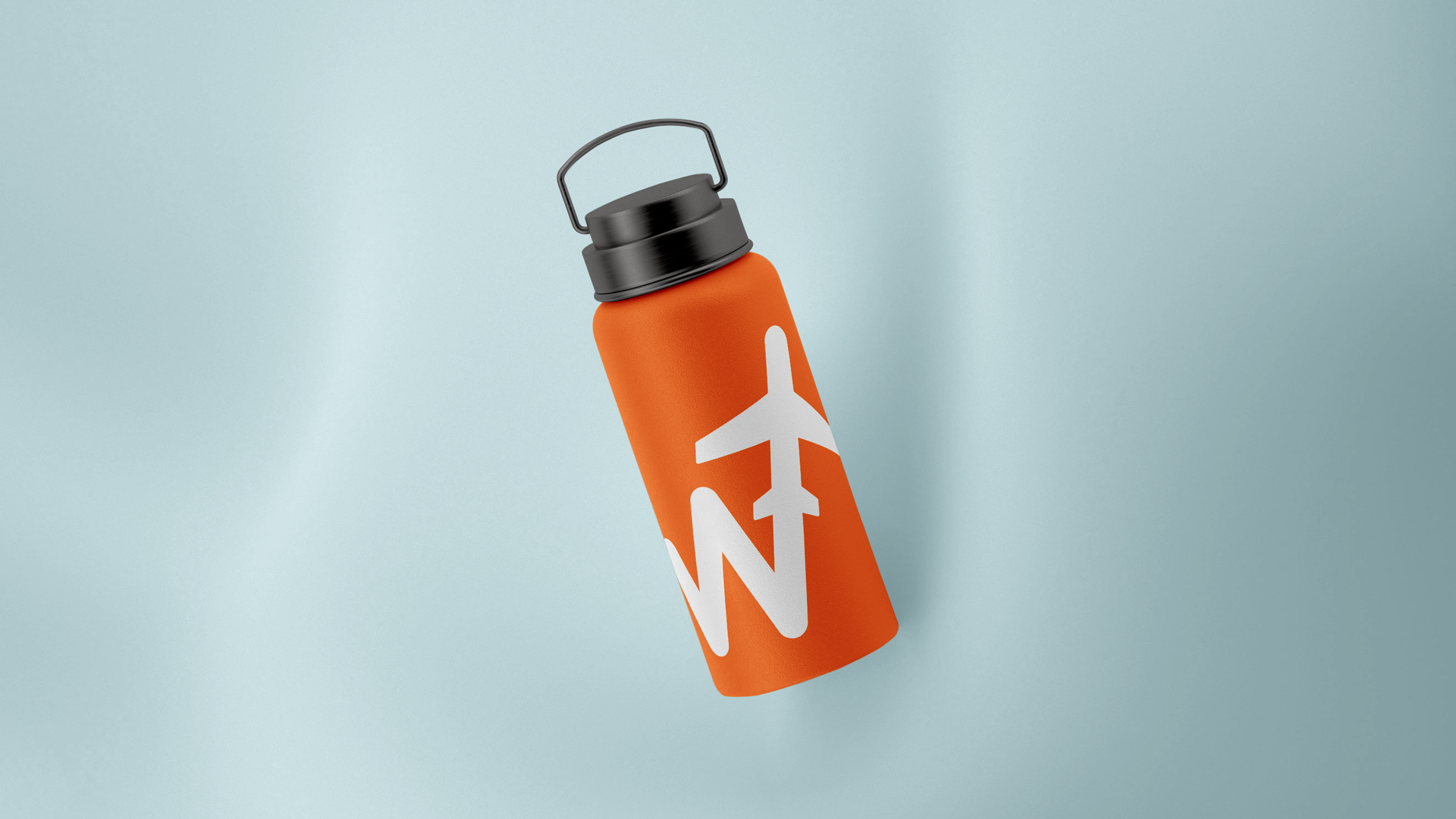
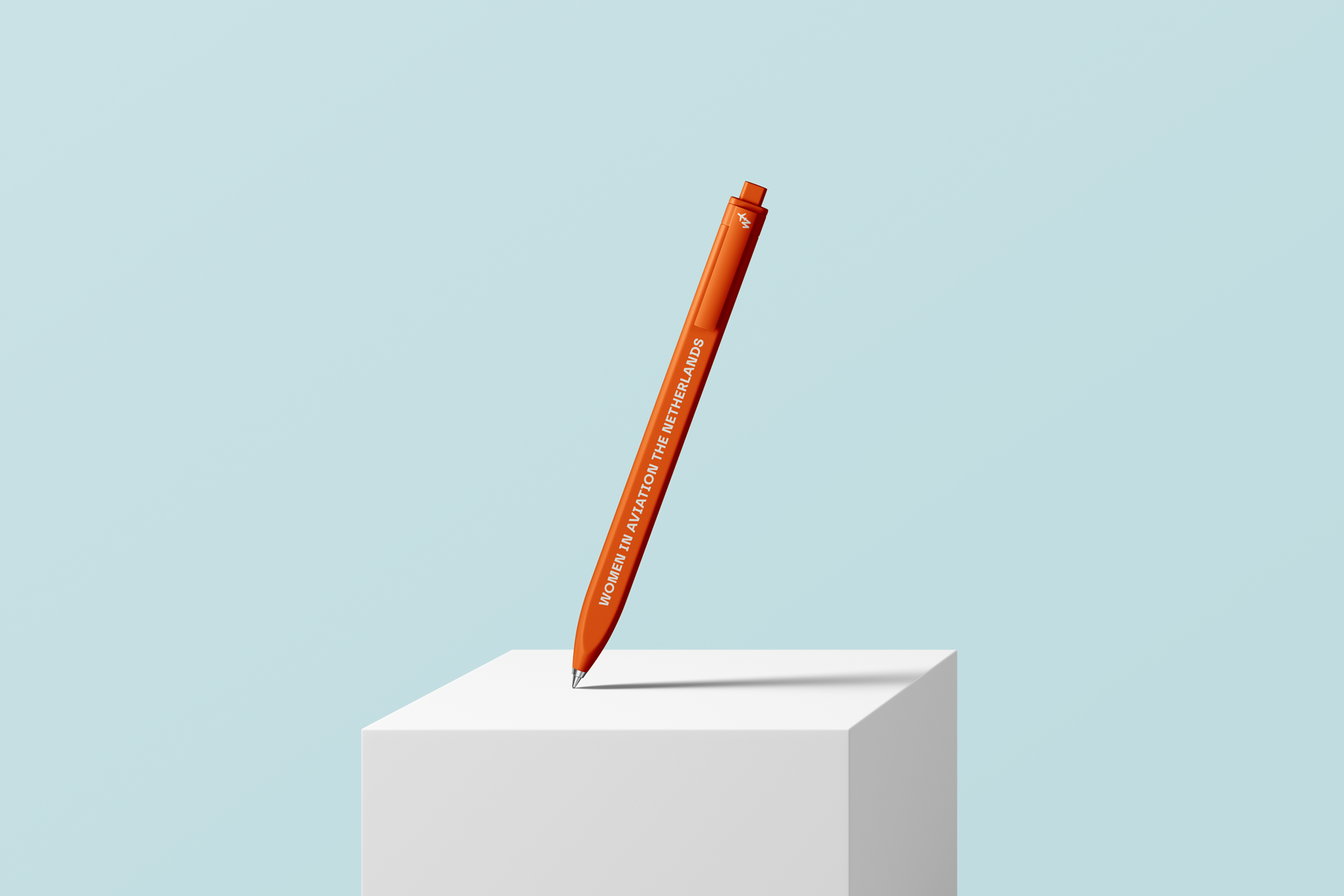
Dutch design is very straightforward, simple, and bold. It suits modern design nowadays to communicate visual ideas fast and clearly, is also able to be applied to different platforms, sizes on social media. With this notion on the logo, we are focusing on boldness and simplicity, yet with meaning behind the visual design plus core ideas for the organization empowering women in aviation around the world.
Dutch design features a lot of type choices as text-only design. According to this idea, a W character represents women, moreover with its shape, it can illustrate a growth graph as the organization is developing women to be more successful with positivity and aviation as the key factor. The beginning is lower than the peak because of to show the development. The letter “N” for “Netherlands” is also hidden.